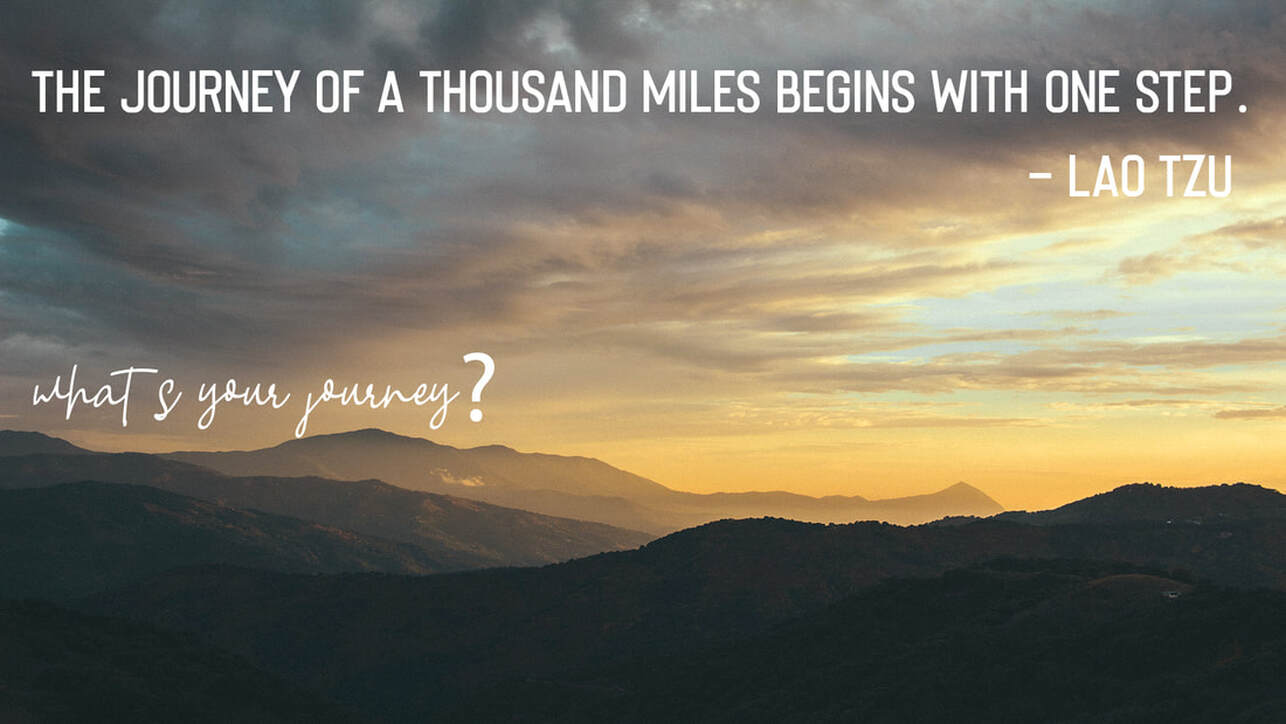
The photo I chose to work with is a little more darker. So I really wanted to focus on the lightness — so I used white colored font to give it that emphasis. I also wanted the quote and the question to be a different fonts. I did this because I wanted the quote to be the first thing a viewer reads — it's bold, in capital letters, it easily captures your attention. The quotes whole purpose is to lead the viewer into thinking about what they could be doing, what's their journey. Which then leads into the question, "What's your journey?" It was important to me that the viewers were left with something impactful.
REPITION:
There really isn't any repetition in this image other than the fonts being the same color. I did this because it's a nice contrast with the dark image but I also still wanted earthy/neutral colors in the image.
ALIGNMENT:
For this image I wanted the quote to be the focus of the image, so I put it on the top line and across the width of the image. I did this because I still wanted the viewers to see the image and understand that in order to get to a pretty view you have to take the first step in a journey. Then I put the question in the middle-bottom because I wanted it to be the second thought/aspect that the viewer noticed.