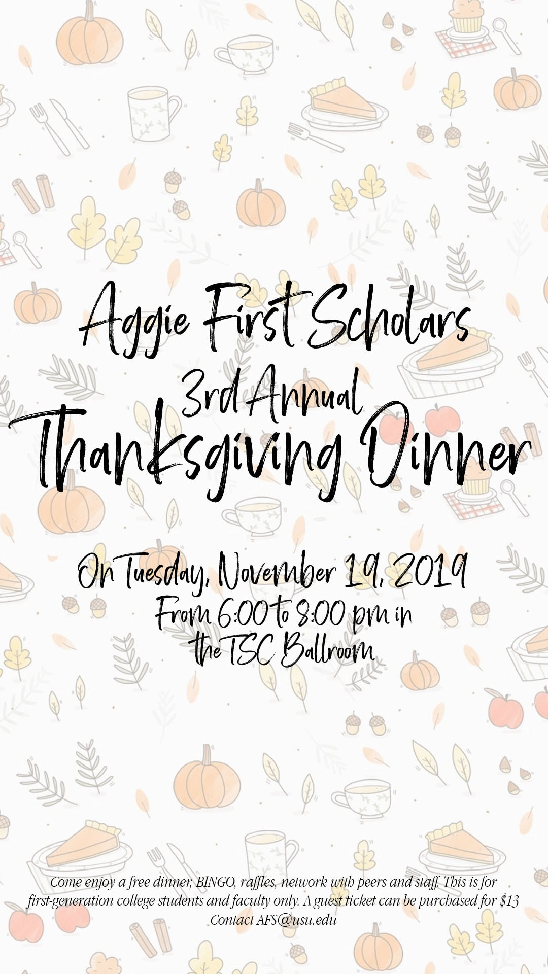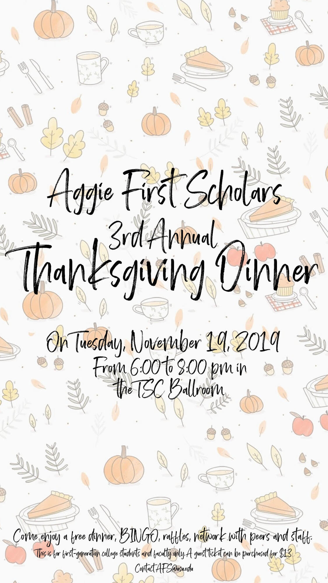
CONSTRACT:
- The contrast I used in this photo is mainly the colors. The background is using light reds, yellows, and tans — so I wanted the font to stand out with out drowning out the background. So the image I used I put the opacity to 50% to allow for the text to be seen and readable for the consumer.
- The only repetition I used in this graphic is the font — which I was nervous to do because I love using multiple fonts and elements to graphics. However I wanted to really go for a fun, warm, and easy-going vibe when creating this graphic. The font I used was Brother Home and I love the feeling it gives the graphic and I chose to just use one font because it conveyed the message I wanted to give my consumers.
- For the alignment of this graphic I wanted to put the text in the middle of the page because I wanted this to be used to advertise on Instagram, specifically on Instagram Story. However, I did play with the alignment a lot because I didn't want there to be too much empty space on top but not too much empty space in the middle if I had out the words more towards the top. I also put some information on the bottom of the graphic in a smaller font because it's important information but wanted the focus to be on the event name, date, and time.
- Font: Metric and Brother Home
- Image: Thanksgiving Wallpaper
The Process.
The idea behind this graphic was to be used for Aggie First Scholar's Instagram story.
For the background I got a photo off of Pinterest and took the opacity to 43% in my original post the opacity was at 63%. I chose to bring the opacity down because I feel like the background was a bit distracting and drowned out the text. I then used Brother Home for the main font because I wanted to go for a handwritten note feel and then for the information I used Metric because in my original graphic I used only Brother Home and it made it hard to read the information.
For the background I got a photo off of Pinterest and took the opacity to 43% in my original post the opacity was at 63%. I chose to bring the opacity down because I feel like the background was a bit distracting and drowned out the text. I then used Brother Home for the main font because I wanted to go for a handwritten note feel and then for the information I used Metric because in my original graphic I used only Brother Home and it made it hard to read the information.