CONSTRACT:
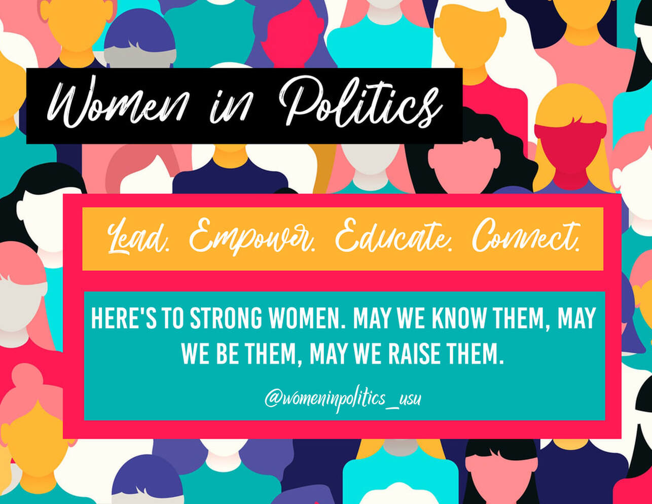
- The only contrast I used in the photo is the font. I really wanted the words to stick out from the bright colors, however, I do want to change the yellow block because the yellow and white is a little too harsh on the eyes. I really wanted to play around with more vibrant colors — still weird for me but I love that I got to experiment with it.
- The main use of repetition in this graphic is the font and the colors. I really wanted this to be a fun and uplifting graphic so the background colors are very vibrant. The words were important to be white because I still wanted it to have some sleekness to the image. I also wanted the quote to be it's own font because I feel like it's a very powerful quote and the capital letters really sets the tone.
- For this assignment I really wanted to take from McWade's reading about using different layouts to display text and information. I went for rectangles just because I was a little more comfortable using this shape. I tried using circles and stars but it seemed a little tacky in my opinion so I played it a little safe and stuck to straight-edged shapes.
- Photo
- Font:
- Bebas Kia,
- HillBear
- Winteradiva
- DaFonts.com
- Bebas Kia,
The Process.
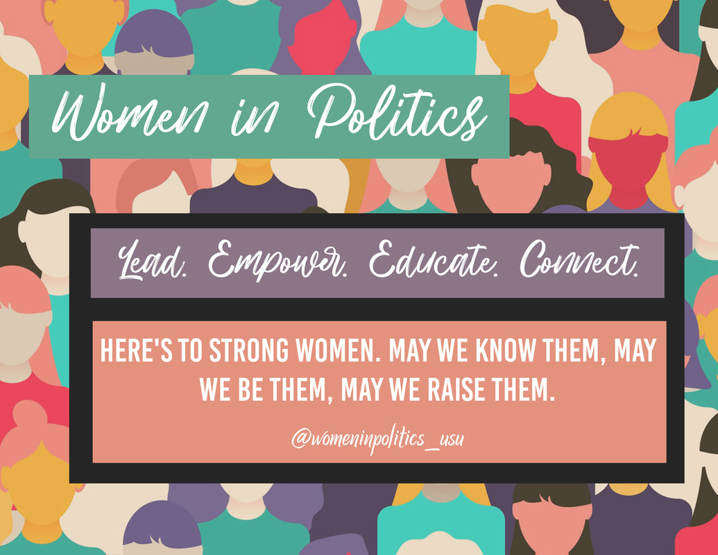
The purpose behind this graphic was specifically going to be used to advertise for the Women in Politics club on USU's main campus. I wanted this graphic to be colorful, eye-catching, and full of empowerment.
However, the colors I originally used were too loud on the eyes and it turned viewers away so I chose to change it a bit. You can see the final product at the bottom.
I used the rectangle shape tool to create font boxes — I color picked the colors from the photo in order for the photo to be cohesive. I then changed the opacity of the background to 54% to dilute the background and allow for the fonts to stand out. I also changed some of the rectangle colors to more pastels so it's easier for viewers to read the graphic.