|
CONSTRACT:
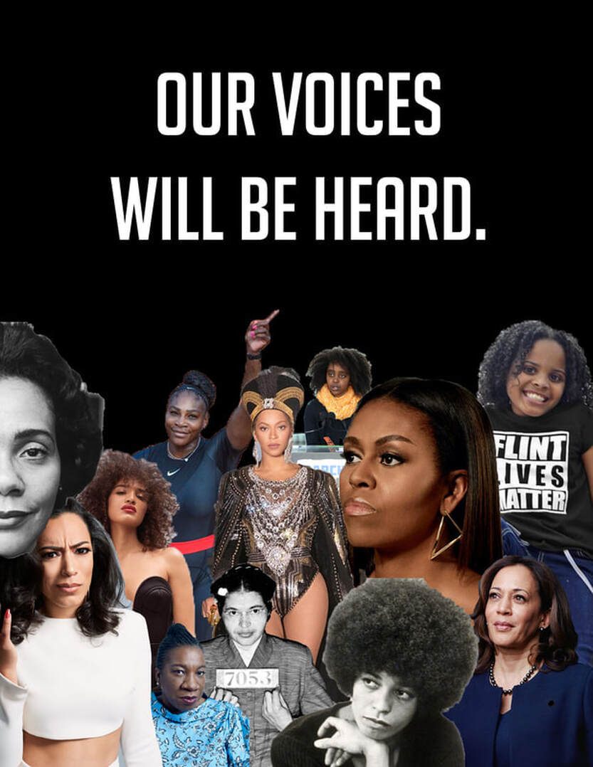
I am absolutely in love with what I created. I think the usage of a black background with strong black women sends a message of solidarity. I know that in the book its states to stray from using all capital letters, however, I felt that it was very important to have this words in bold. |
The Process.
I originally started off with having the women in a pink ombre back ground — I did this because I wanted the theme of the photo to be about black femininity and about the power of being a woman who stands her ground. However I wasn't a fan of the pink after putting in all of the cut outs of the women so I started to toy around with different colors — red, yellow, green, white, and then finally a pure black background.
I ended with the black background because it fit the narrative better. I wanted my viewers to embody the strength of black women and notice their elegance and grace. I also chose black because I want the simplicity of the look but also to go with the theme of black women. If you notice in the graphic there is a range of ages, ways of activism, and tones of black. I wanted this graphic to be a place of inclusion and love.
I ended with the black background because it fit the narrative better. I wanted my viewers to embody the strength of black women and notice their elegance and grace. I also chose black because I want the simplicity of the look but also to go with the theme of black women. If you notice in the graphic there is a range of ages, ways of activism, and tones of black. I wanted this graphic to be a place of inclusion and love.
